


We’re about to perform an autopsy on 15 lead generation quizzes.
On the surface, they look alive—they generate clicks, they capture some emails.
But internally, they are conversion dead. The cause of death, in almost every case, is the same: a complete failure of psychological persuasion.
Most marketers mistakenly believe the purpose of a quiz is to collect data.
They build glorified surveys, asking a series of logical, emotionally sterile questions that bore users into submission or abandonment. It’s a fatal error.
In this deep dive, we will act as forensic investigators.
We will slice open 15 real-world examples and examine their core—the questions—to reveal precisely where the life drains out of the sales process.
By the end, you won’t just have a list of critiques; you will have the ability to spot these conversion-killing mistakes in the wild, ensuring you never make them yourself.
1. Noom Weight Loss Lead Generation Quiz
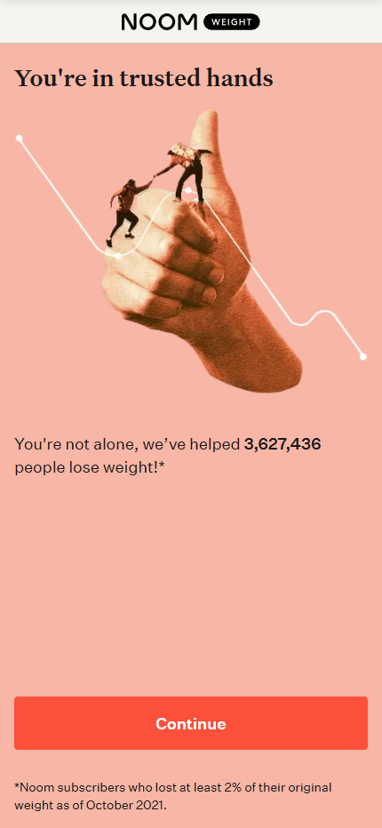
The Noom quiz is less of a simple quiz and more of a comprehensive, interactive onboarding process that functions as a sophisticated sales mechanism.
It’s designed to maximize micro-commitments and build the user’s belief that a truly personalized plan is being created just for them.
Click to see the full quiz in Figma
What Makes This Work
The quiz’s greatest strength is making the user feel seen.
The “WE PREDICT YOU’LL BE: 80 kg by 4 Dec” (Screen 17) is a genius move.
It sells the destination before the journey even begins, making the outcome feel tangible and creating immense desire.
The “Quiz as a Sales Pitch” Model:
Noom doesn’t wait until the end to sell. It weaves in social proof (“we’ve helped 3,627,436 people”), scientific claims (“Lose twice as much weight”), testimonials, and its core value proposition (“long-term results through habit… not restrictive dieting”) throughout the quiz.
This continuously reinforces their authority and the value of the program.
Education Breeds Trust:
By teaching small concepts like caloric density (“Grapes vs. Raisins”) and mindful eating (Screens 87-90), Noom positions itself as an expert guide, not just a product.
The user feels they are already getting value, which builds trust and makes them more likely to invest.
What’s Missing
The quiz begins with a “DEMOGRAPHIC PROFILE.” This is pure, impersonal data collection.
It completely misses the opportunity to engage the user emotionally from the first click.
Instead of starting with aspiration (“I want to feel confident in my clothes again”), it starts with a sterile form-fill.
It captures the user in an information-giving state, not an information-seeking or aspirational one.
Weak Problem Agitation:
The problem-aware questions are present (e.g., Screen 35: “My weight has affected my ability to socialize…”) but they are framed as simple “Yes/No” questions.
This is a low-friction way to segment users, but it’s far less powerful than forcing a user to choose an answer that begins with “I struggle with…”
A “Yes” click is a quiet acknowledgement; selecting a statement that vocalizes your internal struggle is a much more powerful act of self-identification that moves you into a Problem State.
The Missed Opportunity
Noom has built an incredibly effective data-gathering and user-commitment machine. The missed opportunity is not in its mechanics, but in its emotional architecture.
By simply re-sequencing the existing questions, they could create a much stronger state of intent.
2. Wisey ADHD Lead Generation Quiz
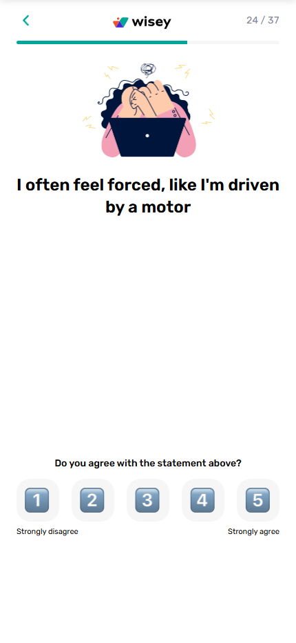
The Wisey quiz is a prime example of a funnel that uses the “self-diagnosis” hook to capture a highly motivated audience.
It’s designed to take someone with a nagging suspicion (“Do I have ADHD?”) and systematically confirm their fears, leading them directly to a proposed solution.
Click to see the full quiz in Figma
What Makes This Work
“Manage ADHD, Unlock Full Potential. 5-MINUTE ADHD TEST.” This is a brilliant opening. It immediately calls out the audience, identifies their core problem (ADHD), and promises their desired outcome (unlocking potential) via a quick, low-commitment action (a 5-minute test).
Deep Problem Resonance:
The quiz questions are exceptionally well-crafted to resonate with the target audience.
Statements like “I forget words… in the middle of a conversation,” “I struggle to relax, even with a lot of spare time,” and “I often feel forced, like I’m driven by a motor” make the user feel deeply seen and understood. This builds immense rapport and trust.
Tangible Outcome & Future Pacing:
Like Noom, Wisey provides a specific future prediction (Screen 48: “we predict that by October 25, 2025, you will see positive changes”).
It then lists concrete benefits like “Improve focus” and “Manage time,” turning an abstract promise into a tangible outcome the user can envision.
The high-pressure “Spin the wheel” tactic (Screen 54) further increases urgency.
Where It Falls Short
The quiz completely skips the positive, aspirational opening. The very first substantive question (Screen 4) asks the user to identify their struggles (“Low motivation,” “Non-stop racing thoughts,” etc.).
It immediately puts the user in a Problem State without first anchoring them to their desired future. This is effective for problem agitation but misses the opportunity to build positive momentum and emotional contrast.
One-Note Emotional Experience:
Because it starts negative and stays negative, the quiz is a relentless confirmation of the user’s pain points.
While effective, it’s an emotionally draining experience rather than a transformative journey.
There is no arc. The user’s emotional state is “concerned” at the beginning and “very concerned” by the end.
The Missed Opportunity
Wisey has created a highly effective problem-agitation engine. It excels at taking a curious user and turning them into a problem-aware lead.
However, it could be even more powerful by incorporating a proper emotional arc.
3. Simple – Intermittent Fasting Lead Generation Quiz
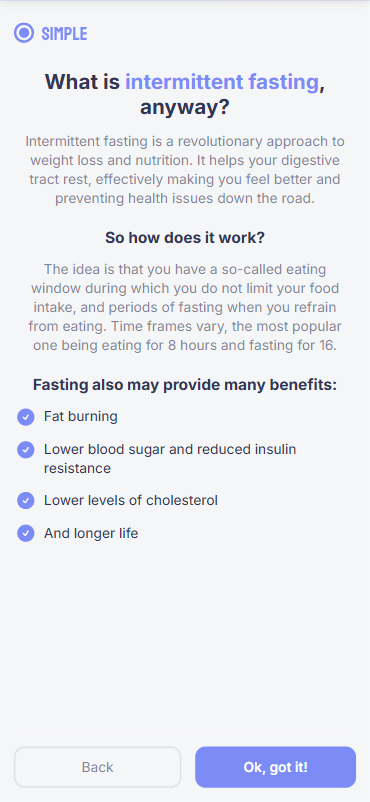
The Simple quiz is a sophisticated onboarding machine that positions itself not just as an app, but as a holistic wellness partner.
It masterfully uses education and a deep dive into the user’s psyche to build trust and create the perception of a hyper-personalized plan.
Click to see the full quiz in Figma
What Makes This Work
The quiz doesn’t assume prior knowledge.
It starts by explaining what intermittent fasting is, immediately positioning Simple as a helpful, authoritative guide.
This builds trust and lowers the barrier to entry for users who are curious but uninformed.
Deeply Emotional Questions:
This is the quiz’s superpower. It goes far beyond the typical “what do you eat?” questions.
It asks about core human desires and pains: “With Simple, I’d like to: Increase my self-worth,” “Have you recently felt frustrated when getting dressed?” and “At my happy weight, I see myself: Feeling empowered…”
These questions create a powerful emotional connection and tap into the user’s true motivations.
The “Why” Behind the “What”:
Simple frequently explains why it’s asking a question (e.g., “No judgment: This will help us personalize your plan.”).
This reduces user friction and reinforces the idea that a truly custom plan is being built, making them more invested.
Where It Falls Short
The quiz is a marathon, not a sprint.
While many individual questions are good, their sheer volume turns the experience from an exciting journey of self-discovery into a tedious chore.
Frankly, I was bored to death going through it.
The user starts to feel less like a person being understood and more like a data source being mined.
This fatigue is a conversion killer; it drains the excitement and momentum required for a user to take action at the end.
The “False Finish” Betrayal:
The screen that says “Almost done! Let’s finish this” only to be followed by another 15+ questions is a cardinal sin of quiz design.
It shatters the user’s trust and expectation.
I felt an immense sense of disappointment at that moment.
Momentum is a fragile and precious commodity in a funnel; this false finish shatters it.
It replaces the user’s building anticipation with frustration and annoyance, significantly increasing the probability they will abandon the quiz before ever seeing the final offer.
The Missed Opportunity
Simple has a goldmine of emotionally resonant questions. The opportunity lies in structuring them to create a powerful, and concise, emotional journey.
4. Nebula Palm Reading Lead Generation Quiz
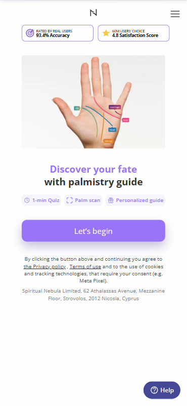
The Nebula quiz is a masterclass in capturing attention with a mystical hook and creating a powerful illusion of personalization.
It’s designed to make the user feel like a unique, cosmic secret is about to be revealed to them, building value and anticipation before presenting the offer.
Click to see the full quiz in Figma
What Makes This Work
“Discover your fate with palmistry guide” is an incredibly strong premise.
It taps into a deep human desire for meaning, certainty, and self-understanding.
The promise of a “1-min Quiz” and “Palm scan” makes it feel fast, easy, and technologically advanced.
The “Pseudo-Personalization” Engine:
This is the core of the funnel.
Questions about hand shape, line depth, and finger length, culminating in the “Palm scan,” are designed to make the user feel that the results are hyper-specific to them.
This process of active participation (observing your own hand) dramatically increases investment and belief in the final product.
A Clear (Though Brief) Emotional Arc:
The quiz actually follows the fundamental Positive -> Neutral -> Negative sequence.
- Positive: It starts with a goal-oriented question (Screen 4: “What is your primary goal or curiosity…?”).
- Neutral: It moves through a series of diagnostic, data-gathering questions (hand shape, line type, etc.).
- Negative: It has a distinct pivot point on Screen 12 (“When you think about your goals, you feel…”) with options like “Cautious. I’ve struggled before” and “A little anxious, honestly.” This is a well-placed question that shifts the user’s emotional state from curious to problem-aware.
Low-Friction Trial Offer:
The “Choose a Trial Price” model, starting as low as $1, is a very effective way to minimize the barrier to entry and capture the conversion. It frames the purchase as a low-risk decision.
Where It Falls Short (According to Our Intent-Building Framework)
While the emotional arc exists, it’s shallow.
The positive opening is a single question about “curiosity,” which is less emotionally resonant than a question about a deep desire (e.g., “I wish to find…”).
Similarly, the negative pivot is just one question. It successfully introduces the feeling of anxiety but doesn’t agitate it.
It doesn’t force the user to confront the consequences of that anxiety or struggle, which is where true intent is forged.
The Missed Opportunity
Nebula has a brilliant hook and a compelling interactive element.
To elevate it from a clever lead capture tool to an unstoppable conversion machine, it needs to deepen the emotional journey and bridge the gap between problem and solution more explicitly.
5. BetterMe – Fitness Lead Generation Quiz
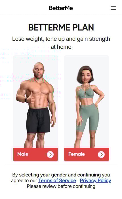
BetterMe is a fitness and wellness app that uses a highly comprehensive quiz to generate leads for its personalized meal and workout plans.
The quiz is a lengthy, multi-step process designed to gather extensive data about the user’s goals, habits, and preferences.
Click to see the full quiz in Figma
What They Did REALLY Well:
The single best element in this quiz is asking about a specific upcoming event (vacation, wedding) and using that date to create a tangible timeline.
Showing a prediction like, “You’ll be 82kg by August 15th – just in time for your Vacation” is brilliant. It connects a logical goal to a powerful, real-world emotional driver, making the outcome feel concrete and achievable.
Visual Goal Association:
Using images of different body types helps users visually connect with their desired outcome.
This is a simple but effective way to make the goal-setting phase more engaging and less abstract.
Perceived Professionalism:
The sheer volume of questions and the final “wellness profile” section successfully frame the process as a serious, in-depth assessment.
This can increase the perceived value of the final result, making users feel they are getting a truly comprehensive plan.
What’s Missing
This quiz feels less like a transformational journey and more like filling out intake forms at a doctor’s office.
It asks what the user wants but never builds the emotional why.
The process is a logical interrogation, not an emotional experience, causing the user’s initial excitement to decay with every question.
❌ No Psychological Arc or Tension
A high-converting quiz builds momentum. It should start positive (goals), transition to negative to create tension (the pain of the current situation), and then offer the solution as a release.
This quiz starts with goals and then devolves into a monotonous data-collection marathon (“How much water do you drink?”, “Select vegetables”).
There is no build-up, no climax, and therefore no urgency.
The Psychology They Missed:
This funnel is the perfect example of a logistical onboarding form disguised as a marketing quiz.
It excels at gathering the necessary data to build the product (the meal plan) but fails at its primary marketing job: to sell the transformation.
They Confuse Data Personalization with Emotional Personalization:
Showing a user a weight prediction for their vacation date is excellent data personalization. It’s logical and clever.
However, the quiz fails at emotional personalization, which would involve making the user feel the deep-seated desire for the confidence, energy, and freedom they’ll experience on that vacation.
The Journey is Broken:
The quiz serves its purpose as a data-collection tool but fails as a psychological sales presentation.
It does not properly transition the user from an information-seeking state to a problem-aware state, and then to a solution-ready state.
Because it skips the crucial “problem” phase, the final offer feels like a “nice-to-have” rather than an “I-need-this-now” solution.
6. Red Clover – B2B Lead Generation Quiz
Red Clover Advisors, a data privacy consultancy, uses a quiz to engage and educate potential clients.
The quiz’s defining feature is its heavy use of humor to make a traditionally dry and technical B2B topic (data privacy) more accessible and entertaining.
Click to see the full quiz in Figma
What They Did REALLY Well:
This quiz is a masterclass in using humor as a pattern interrupt.
In a sea of boring B2B questionnaires, lines like “The kind that spend money” and “I use Google Maps for directions” are memorable and engaging.
It immediately establishes a relatable, witty brand personality.
Brilliant Audience Rapport:
The quiz demonstrates a deep understanding of its target user (likely a non-technical marketer).
The recurring “I’m in marketing!” answer choices make the prospect feel seen and understood, brilliantly lowering their guard and building rapport by acknowledging their specific reality.
Subtle Authority Building:
While being humorous, each question is a micro-lesson in data privacy.
By asking about data mapping, incident response plans, and individual rights, they are educating the prospect on the scope of the problem while simultaneously positioning themselves as the go-to expert who understands these complexities.
What’s Missing
The quiz’s greatest strength—its humor—is also its fatal flaw.
The humor is used to deflect the negative emotions associated with data privacy risks, rather than to introduce them.
The user chuckles at their own ignorance but is never forced to feel the cold-sweat anxiety of a multi-million dollar fine, a catastrophic data breach, or the loss of customer trust.
❌ Entertainment Over Intent
The quiz is optimized for engagement, not for conversion.
The user leaves thinking, “That was clever and fun,” not “We are dangerously exposed and I need to solve this problem immediately.”
It successfully creates a memorable brand experience but fails at its primary job: to manufacture buying intent by escalating a perceived problem.
The Psychology They Missed:
This funnel is a perfect example of a personality-driven quiz, not a problem-driven one.
It does an excellent job of showcasing Red Clover’s brand personality but does a poor job of diagnosing and agitating the customer’s urgent business problem.
The core psychological failure is the inability to transition the prospect from an Information State (learning about their knowledge gaps in a fun way) to a Problem State (feeling the financial and reputational terror of what those gaps could cost their company).
By prioritizing entertainment, they sacrifice urgency.
The quiz creates a lead who likes them but doesn’t necessarily need them.
It’s a fun, friendly conversation that ends right at the moment a high-converting funnel would be applying pressure and presenting the only logical path to relief.
7. FEA – Business Assessment Lead Generation Quiz Example
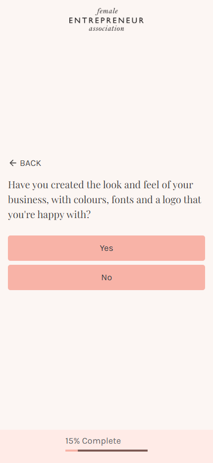
The Female Entrepreneur Association (FEA) uses a quiz to assess the business maturity of its audience, likely to segment them for different offers.
The quiz functions as a comprehensive checklist, covering key operational areas from email marketing to sales funnels in a simple yes/no format.
Click to see the full quiz in Figma
What They Did REALLY Well:
Logical Structure:
The quiz follows a sensible progression that mirrors a typical business growth journey, moving from foundational elements to more advanced sales and marketing tactics.
This makes the assessment feel organized and thorough.
Frictionless User Experience:
The simple “Yes/No” format is incredibly easy and fast to navigate. This likely results in high initial completion rates because the barrier to participation is extremely low.
Effective Segmentation:
From a pure data-collection standpoint, the quiz is effective.
It successfully sorts users into clear categories based on their operational maturity (e.g., beginner, intermediate, advanced), allowing for targeted follow-up marketing.
What’s Missing
This quiz is the epitome of a transactional, unemotional experience.
It is a checklist, not a conversation. Questions like “Do you have an email list?” are devoid of any emotional context.
The user feels like they are being audited, not inspired. There is no attempt to shift their emotional state.
❌ No Psychological Arc — It’s a Survey, Not a Journey
The quiz is entirely static. It starts on a neutral, informational note and never deviates.
A high-converting quiz must architect a journey: from the excitement of the entrepreneurial dream (Positive), to the frustrating reality of their current roadblocks (Negative), to the desperate need for a solution.
This quiz completely skips the emotional narrative.
❌ Zero Stakes or Urgency
The quiz identifies operational gaps but fails to attach any consequences to them. It asks if you have a sales page, but never makes you feel the financial pain and lost opportunity of not having one.
Without establishing the cost of inaction, there is no urgency. The problems identified feel like items on a to-do list, not critical business emergencies.
The Psychology They Missed:
This funnel is a perfect example of a business assessment tool masquerading as a marketing quiz.
Its fatal flaw is that it diagnoses problems without making the user feel the pain of the disease.
- They Mistake Information for Transformation: The quiz successfully gives the user information about their business’s status. It completely fails to create a transformational experience that changes how the user feels about that status.
- No “Gap” Creation: The most powerful thing a quiz can do is create a painful gap between where the entrepreneur is and where they desperately want to be. This quiz simply documents where they are. It builds a map but provides no emotional fuel for the journey.
The result is a quiz that is functional but entirely forgettable.
It generates a segmented email list of lukewarm leads, leaving a massive amount of potential revenue on the table by failing to convert a simple assessment into a psychological sales presentation.
8. Auto Finance Lead Generation Quiz
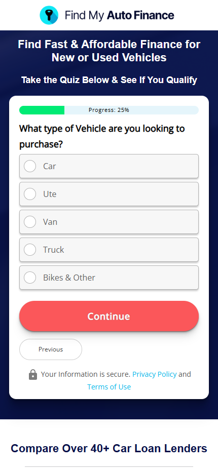
This Australian car financing company uses a quiz that is essentially a loan application form disguised as a lead magnet. It is designed to gather financial data for pre-qualification.
Click to see the full quiz in Figma
What They’re Doing
They’re collecting all the necessary information a lender would need – income, employment status, credit rating, loan amount. It’s efficient for their underwriting process.
Australian-Specific: They’ve tailored it properly for their market with citizenship status, DVA pension options, and postcode collection.
Clear Process: The flow is logical and ends with a clear “pre-qualified” message that sets expectations for next steps.
The Problems
❌ Catastrophic Emotional Flatline:
This is not a quiz; it is a sterile financial interrogation. It is 100% transactional and devoid of any human element, making it feel like filling out a bank form.
❌ Zero Psychological Arc:
The funnel is completely static. It starts and ends as a data-collection exercise with no emotional journey, no tension-building, and therefore no manufactured desire for their service.
❌ No Value Proposition:
The quiz completely fails to answer the most important question: “Why should I use you over a bank?” It never presents a reason to choose their service, operating as if the user is already sold.
The Psychology They Missed:
The funnel’s fatal flaw is treating an emotional purchase as a purely logical transaction.
Buying a car is an emotional event, while financing it is often stressful. This quiz ignores this entire psychological landscape.
By failing to agitate the common pain points of traditional financing (slow approvals, confusing paperwork), it cannot position its service as the necessary solution.
It’s a functional data-entry tool that completely fails at its core marketing job: to create a customer.
9. Luvly – Skincare Lead Generation Quiz Example
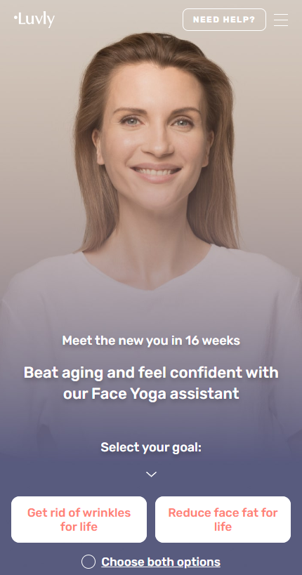
This quiz from Luvly is much more sophisticated than the previous ones – they’re clearly trying to create an emotional journey, but it’s still missing some key elements.
Click to see the full quiz in Figma
What They’re Doing Well:
They include several powerful psychological questions like “The reflection in the mirror affects my mood and self-esteem” and “I’m afraid that people won’t like me if I look older.”
These tap into real insecurities around aging and appearance.
Comprehensive Assessment:
They cover skincare routines, diet, lifestyle factors, and even mental health – showing they understand the holistic nature of skin health.
The psychological assessment questions are genuinely powerful.
When someone rates themselves a 5 on “I’m afraid people won’t like me if I look older,” that creates real emotional investment in finding a solution.
Social Proof and Authority:
They reference Harvard Medical School research, show expert credentials, and mention “273,908 women” using their program. This builds credibility.
Personalized Timeline:
Like the weight loss quiz, they give a specific date prediction – “Wrinkle-Free Skin by August 8” – which makes the goal feel achievable and concrete.
The Problems:
Mixed Messaging: The quiz jumps between functional emotional questions and basic data collection.
One moment you’re rating how much mirror reflections affect your self-esteem, the next you’re selecting skincare products from a checklist.
No Clear Emotional Progression:
While they have emotional elements, they’re scattered throughout rather than building systematically toward a crescendo of problem awareness.
Too Long:
This is a lengthy quiz that probably loses people along the way. There are 40+ questions covering everything from diet to menstrual cycles.
The User Experience:
The quiz starts strong with goal-setting and has good emotional moments, but it feels disjointed.
You’re answering deep psychological questions about aging fears, then suddenly being asked how many glasses of water you drink per day.
The informational slides break up the flow too much – by the time you get through all the education about face yoga and expert credentials, you’ve lost the emotional momentum.
What’s Missing:
A clear emotional arc that builds systematically rather than randomly inserting emotional questions between routine data collection.
The foundation for transformation is there, but it’s not structured optimally.
10. Nerva – Healthcare Lead Generation Quiz Example
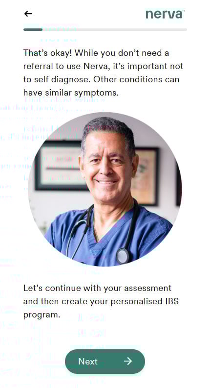
This is a quiz about IBS – a legitimate digestive disorder that affects millions of people.
Unlike weight loss or supplement quizzes that can get away with “creative claims”, this needs to maintain clinical credibility while still converting.
The stakes are higher for Nerva because they’re dealing with real medical symptoms and can’t make unsubstantiated health claims.
Click to see the full quiz in Figma
What They’re Doing:
They open with legitimate credentials (Dr. Simone Peters, Monash University clinical trial) and maintain clinical language throughout.
This creates a safe space for people to admit embarrassing symptoms and failed treatments without feeling judged.
Systematic Problem Building: They don’t just ask about symptoms – they create a comprehensive picture of suffering:
- Physical symptoms (bloating, pain, diarrhea)
- Frequency and duration (daily symptoms for years)
- Life impact (can’t socialize, nervous about travel)
- Financial costs (doctor visits, missed work, ineffective treatments)
- Failed solutions (medication, diets, supplements that didn’t work)
Educational Seduction: Rather than just collecting data, they teach throughout the quiz.
The gut-brain connection explanation feels like valuable information, not a sales pitch. They’re positioning themselves as educators first, sellers second.
Future State Visualization: They systematically move from current problems to future possibilities:
- “Imagine yourself in 6 weeks time, how would you like to feel?”
- “What would you want to do if you were free from the control of IBS?”
- “Describe a daily activity that will become easy again?”
Personalized Outcome Prediction: The specific date (“Wednesday, August 20th 2025”) based on “58,000 similar members” creates concrete hope rather than vague promises.
This isn’t just “results in 4-6 weeks” – it’s a personalized timeline that feels scientifically calculated.
Commitment Escalation: They gradually increase psychological investment:
- Time commitment questions (15 minutes daily)
- Consistency questions (5+ days per week)
- Support preferences (coaching, reminders, community)
- Post-success planning (what you’ll do after achieving results)
Social Proof Integration: Testimonials and statistics aren’t dumped at the end – they’re woven throughout as natural validation points when introducing new concepts.
Choice Architecture: From payment options ($1 vs $12 trial) to support preferences, they create a sense of control while guiding toward their preferred outcomes.
The Real Problems:
Despite the sophisticated emotional arc, most individual questions remain clinical and detached.
They use passive, third-person language (“Do you experience symptoms?”, “Have you been diagnosed with?”) instead of first-person ownership that creates emotional investment.
Compare their approach:
- “How often do you experience IBS symptoms?” (clinical, detached)
- “What physical symptoms do you normally experience?” (observational)
Versus functional alternatives:
- “I find myself constantly worried about when my next flare-up will hit” (personal, emotional)
- “I’ve had to cancel social plans because I’m afraid of having symptoms in public” (consequence-focused)
No Emotional Escalation in Question Format:
While the overall quiz builds problem awareness, individual questions don’t intensify emotional states.
They maintain the same clinical tone throughout instead of gradually shifting from neutral to problem-aware to solution-seeking.
Missed Opportunity for Identity Shift:
The questions identify what someone HAS (symptoms, triggers, failed treatments) but don’t help them feel who they’re BECOMING.
There’s no transition from “IBS patient” identity to “person taking control of their health” identity.
Safe but Sterile:
The medical legitimacy comes at the cost of emotional engagement.
They’re so focused on avoiding health claims that they don’t help people feel the true weight of their situation or the excitement of potential relief.
No Pressure Building:
Unlike effective quiz funnels that create urgency through problem amplification, this quiz stays comfortable.
People finish informed but not compelled – they understand their situation better but don’t feel the emotional pressure to change it immediately.
Functional Question Void:
The framework calls for questions that transform emotional states, but Nerva’s questions primarily collect information.
They’re comprehensive but not transformative. Overall best quiz so far.
11. Ramit Sethi – BizOp Quiz Lead Generation Example

This quiz from Ramit Sethi (I Will Teach You To Be Rich) is interesting because it attempts to balance aspiration with practicality, but it has some significant structural issues.
Click to see the full quiz in Figma
What They’re Doing
They’re targeting people who want more than just financial advice – they’re selling a “Rich Life” philosophy that goes beyond money to include freedom, passion, and personal fulfillment.
Values-Based Segmentation:
Rather than just asking about income or age, they’re identifying what people actually value – learning style, life vision, spending priorities. This creates better product-market fit than demographic data.
Aspirational Language:
Questions like “When you envision a Rich Life” and the vacation question tap into desires rather than just current circumstances. They’re selling the dream, not just the solution.
Multi-Dimensional Assessment:
They cover learning preferences, life goals, financial stress, and personal values – giving them multiple angles to customize their approach.
The Problems
The quiz stays at the same aspirational temperature throughout. There’s no journey from positive to problem-aware to solution-seeking.
It’s all “what do you want” without ever making you feel what you’re missing.
Missing Problem Amplification:
They touch on money stress in question 4, but they don’t make you feel the weight of that stress. “Living paycheck to paycheck” is mentioned casually rather than explored emotionally.
Weak Functional Questions:
Most questions are still identifier-based rather than transformational. “What’s your biggest money stress?” vs. “I lie awake at night worried about money because…”
The User Experience
You finish feeling somewhat hopeful about your “Rich Life” but not urgently compelled to change your current situation. The quiz confirms what you already want but doesn’t create the emotional pressure to act on those wants.
The email capture happens before results, which works for a known brand like Ramit but creates friction without first delivering value.
What’s Missing
They ask about dreams but don’t help you feel the gap between those dreams and your current reality. No “I’m frustrated that I can’t afford the lifestyle I want” moments.
The quiz succeeds as a lead magnet for people already interested in financial improvement, but it doesn’t transform casual browsers into motivated buyers.
It’s aspirational without being transformational.
12. Coaching Lead Generation Quiz Example
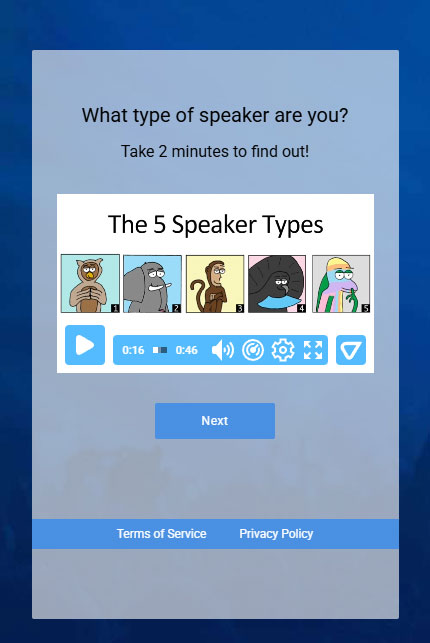
This quiz from Neil Gordon is surprisingly sophisticated and gets several things right that most quizzes miss completely.
Click to see the full quiz in Figma
What They’re Doing
Instead of boring demographic questions, they’re using scenario-based questions that feel like personality tests. “When you were in high school” and “After seeing a terrible Broadway show” are infinitely more engaging than “What’s your age?”
Behavioral Assessment Through Stories:
Each question presents relatable scenarios and asks how you’d respond. This creates genuine self-reflection rather than surface-level data collection. People actually think about their answers.
Clever Indirect Approach:
Rather than asking “Are you a good speaker?” they assess speaking style through personality traits and social behaviors. Much more accurate and less threatening.
Identity-Based Results: Getting labeled as an “OWL” speaker type creates identity investment. People want to know what that means and how to leverage it.
Natural Question Flow: The progression from high school behavior to conflict resolution to storytelling style feels conversational, not interrogational.
The Problems
While engaging, the quiz doesn’t create problem awareness or solution desire.
It’s all assessment without transformation – you finish knowing your type but not feeling compelled to improve your speaking.At least not while you are taking the quiz.
Because the result video was not available I am not sure how they’ve integrated all the information that was gathered.
The User Experience
This quiz succeeds where most fail – it’s actually fun to take.
The scenarios are creative and relatable, making you think “Oh, I’d totally do that!” The personality test format keeps you engaged throughout.
However, you finish entertained but not necessarily motivated. It’s like taking a BuzzFeed quiz – interesting but not compelling.
Based on the comments from people who’ve taken the quiz they found it fun and valuable.
But since it is not running anymore my guess would be it didn’t convert well despite the engagement.
13. ColonBroom – Supplement Lead Generation Quiz Example
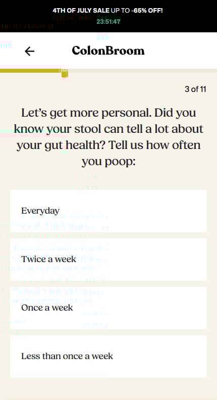
ColonBroom is a supplement company selling a gut health product. Their quiz targets people with digestive problems.
It’s 11 questions about bowel movements, bloating, weight issues, and other gut-related symptoms that are making people feel like crap.
Click to see the full quiz in Figma
What They Did REALLY Well:
Personality & Voice: Most health quizzes are sterile and boring. They created a conversational tone that make people smile.
Engagement Factor: Questions like “Did you know your stool can tell a lot about your gut health?” are bold and attention-grabbing. They aren’t afraid to be direct about uncomfortable topics.
Logical Flow: The progression from general health → specific symptoms → safety considerations → customization makes perfect sense from a product perspective.
Conversational Tone: “Keep going! You’re doing amazing” – they understand the importance of encouragement and momentum.
What’s Missing
❌ Emotional Flatline
Every single question was informational.
No identity building, no problem escalation, no desire creation. It was like having a funny conversation with a doctor instead of a transformation journey.
❌ No Psychological Momentum
They started neutral and stayed neutral. High-converting quizzes start positive to build momentum, then escalate problems to create urgency.
❌ Product-Centric vs. Customer-Centric
Questions focused on “what ColonBroom needs to know” rather than “what emotional journey will make them desperately want a solution.”
❌ No Pain Escalation
They listed symptoms but never made people feel the impact of those symptoms on their life, confidence, or future.
The Psychology They Missed:
The results page should be the emotional climax where all the quiz tension gets resolved.
Missing Elements:
- No reference to their specific quiz answers
- No escalation of their particular problems
- No “this is why other solutions failed you”
- No urgency or scarcity
- No emotional payoff from the journey
The quiz was like a really entertaining product brochure when it could have been a psychological sales presentation.
The personality was there, but the persuasion psychology wasn’t.
14. Biohacking Lead Generation Quiz Example
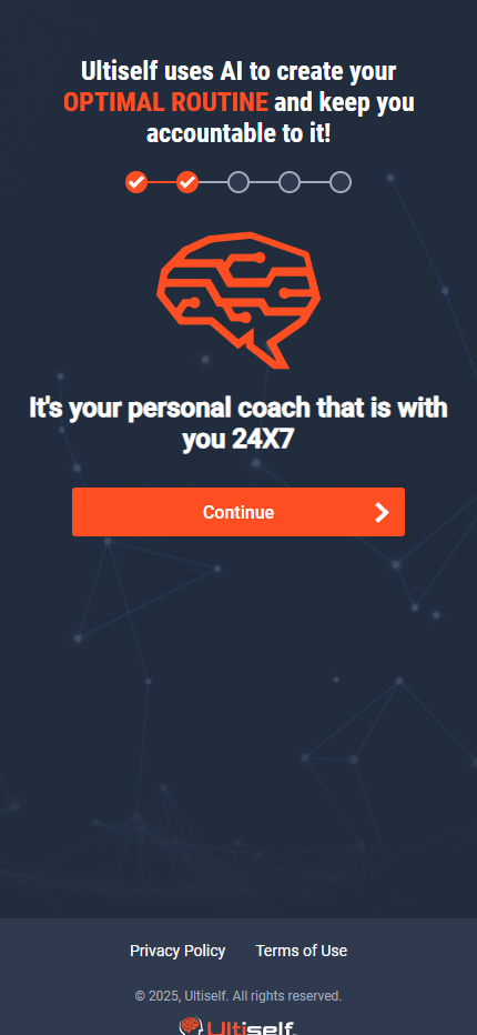
Ultiself quiz targets individuals interested in biohacking and self-improvement to generate leads for their app.
The quiz is a 10-screen process asking about goals, demographics, and specific areas for improvement, culminating in an email capture before a Video Sales Letter (VSL).
Click to see the full quiz in Figma
What They Did REALLY Well:
The landing page copy is tight: “Build your perfect biohacking routine in just 2 minutes, without hiring expensive coaches.”
This is A-list direct response. It’s fast, specific, value-driven, and benefit-packed. It does a perfect job of capturing the user’s highest desire.
Heavy Social Proof:
The strategic placement of founders with impressive credentials (Ex-CIA, PhDs), testimonials from known entrepreneurs (David Meltzer), and key statistics (“407,000+ Routines Created”) is executed well to build initial authority and trust.
What’s Missing
This quiz starts with a powerful, emotionally charged promise and immediately drops into a sterile, logical data-collection process. There is zero emotional state change.
❌ Emotional Flatline & Complete Lack of a Psychological Arc
The user is never transitioned from their initial “information-seeking” state into a “problem” state. They start neutral and end neutral, completely unprepared for a sales pitch.
❌ No Functional Questions, Only Identifier Questions
The quiz completely fails to make the process feel personal or diagnostic.
Every question is an “identifier” designed to segment data, not a “functional” question designed to shift an emotional state.
This immediately begins to break the “custom” promise from the hook.
- Example: “What is your age range?” is a standard question.
- Functional Rewrite: “I’m in my [40s], and I’m concerned that if I don’t optimize my focus and energy now, I’ll fall behind professionally.” This reframes a data point as an emotional reality, making the user feel seen and understood.
❌ App-Centric vs. Customer-Centric Framing
The questions are framed around what the user wants “with Ultiself.” This puts the product, not the customer’s problem, at the center of the experience.
It makes the user feel like they are simply configuring a piece of software, not undergoing a personalized consultation.
❌ Complete Betrayal of the “Custom” Promise
The hook promises a bespoke, “custom” routine. The quiz delivers a generic, checkbox experience. This creates a massive psychological disconnect.
The user subconsciously thinks, “How can they possibly build a custom routine for me from this?”
This erodes trust and creates skepticism long before the VSL is ever shown.
“Results Page” (The VSL Gate & Final Payoff) Analysis
This is where the funnel self-destructs.
The decision to gate the results behind a VSL is a high-risk tactic that, due to the poor setup and payoff, becomes a catastrophic failure.
The VSL “Bait-and-Switch”:
This is the most egregious conversion killer. The hook promises a result in “2 minutes.”
Instead, the user is forced to watch a 6-minute sales video.
This is a direct violation of the initial promise, which breaks trust and creates immediate frustration and annoyance.
Sky-High Expectations, Rock-Bottom Payoff:
The forced 6-minute wait does one thing effectively: it dramatically inflates the user’s expectations for the final result.
They invest their time, expecting a hyper-personalized, mind-blowing routine.
When they finally receive a generic, one-size-fits-all PDF, the feeling is not just disappointment—it’s betrayal.
Zero Problem Reinforcement:
The loading screen before the VSL is a dead zone.
Instead of “Analyzing your demographics,” it should have reinforced the user’s specific problems to bridge the gap: “Based on your goal to improve FOCUS, we’re identifying the 3 biggest routine-killers holding you back…”
This would have made the process feel more legitimate.
Generic Result Invalidates the Entire Funnel:
The final generic result proves that the “custom” promise was a lie from the very beginning.
This doesn’t just lose a sale; it creates a negative brand experience, ensuring the user will never trust Ultiself again.
The Psychology They Missed:
The entire funnel is built on a brilliant promise that it immediately begins to undermine at every subsequent step.
The VSL-gate tactic is not inherently bad, but it requires a quiz that builds immense tension and a final result that provides an earth-shattering emotional payoff.
This funnel’s journey is a recipe for disaster:
- The Promise: We will give you a custom solution, fast.
- The Interrogation: Give us your generic data.
- The Annoyance: Now wait 3x longer than we promised and watch a sales pitch.
- The Betrayal: Here is the generic document we give to everyone.
They created a sales process that manufactures skepticism and breaks trust, when they could have architected a psychological journey that manufactures intent and creates pre-sold customers.
15. Dating Offer Lead Generation Quiz
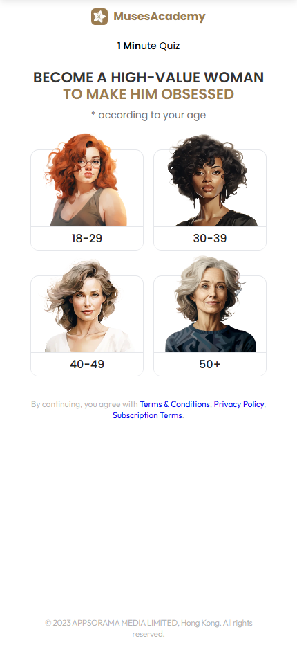
MusesAcademy, a relationship coaching platform, uses a lengthy 24-question quiz to generate leads for its program.
The quiz starts with a highly provocative hook, promising to transform the user into a “high-value woman” to make a man “obsessed,” and culminates in the offer of a “Personal Love Life Growth Plan.”
Click to see the full quiz in Figma
What They Did REALLY Well:
The initial headline, “BECOME A HIGH-VALUE WOMAN TO MAKE HIM OBSESSED,” is a masterclass in desire-based marketing.
It bypasses logic and speaks directly to a core, often unspoken, emotional goal. This is an A-list hook that guarantees high initial engagement from their target audience.
Early & Effective Pain Agitation:
Unlike most quizzes, this one immediately moves to create a problem state.
Questions like “How do you feel about your love life?” and “How often do you feel like you give more than you take?” are functional questions designed to make the user confront their current dissatisfaction and pain right away.
Tangible Future Pacing:
The quiz uses a timeline (“gain confidence… by November 2025”) and ties goals to an important upcoming event.
This is a powerful technique that transforms an abstract desire (“a better love life”) into a concrete, time-bound, and achievable goal in the user’s mind.
The Psychology They Missed:
This funnel is one of the most sophisticated attempts analyzed, yet it stumbles by trying to do too many jobs at once.
It acts as a diagnostic tool, an educational module, and a sales presentation simultaneously, which muddles the emotional journey.
The key missed opportunity is the failure to maintain a clean, escalating emotional narrative.
They successfully identify and agitate the user’s core problem, but they don’t have the confidence to let that pain build.
They repeatedly break the tension to prove how smart they are.
The result is a quiz that is psychologically powerful in moments but inconsistent as a whole.
It creates a lead who is definitely problem-aware and sees them as an authority, but who may have lost the acute, “I need this NOW” urgency that was so masterfully created in the first five questions.
It’s a strong funnel that leaves significant conversion potential on the table by failing to keep its foot on the emotional gas pedal.
What Makes a Good Lead Gen Quiz
After analyzing these quizzes, you might be wondering – what separates the high-converting ones from the mediocre ones?
Why do some quizzes feel engaging while others feel like boring surveys?
The answer lies in understanding that most quiz funnels are built backwards.
They focus on collecting information about prospects rather than transforming how prospects feel about their situation.
This is why completion rates are often terrible and conversions are weak.
The framework we’ve been evaluating against takes a completely different approach.
Instead of just identifying customers through basic demographic questions, it focuses on creating customers by systematically shifting their emotional state throughout the quiz experience.
The key breakthrough is using “functional questions” – questions that serve a psychological function rather than just collecting data.
Instead of asking “How old are you?” you ask “This year, I’m…” with emotionally charged answer choices that make people feel something about their age and situation.
The optimal quiz structure follows a specific emotional arc:
- Start Positive: Use “towards” language (I want to, I hope to) to create momentum and engagement
- Move to Neutral: Transition with behavior-based questions (I tend to, Sometimes I)
- End Negative: Use problem-aware language (I struggle with, I’m afraid that) to create ownership of the problem
- Pressure Release: Finish with choice-based questions that direct to personalized solutions
This transforms prospects from an “information-seeking state” through a “problem state” and finally to a “solution state” where they’re primed to buy.
Most quizzes skip the crucial problem state phase, which hurts conversions despite the initial interest.
The goal is psychological transformation – by the end, prospects should feel they’ve admitted to having a problem they can’t solve alone, creating genuine buying intent rather than just curiosity.
This evaluation framework is based on extensive research into high-converting quiz psychology and is outside the scope of this article.
For the complete guide with detailed examples and implementation strategies, visit our Ultimate Guide to Creating High-Converting Quiz Funnels.
After analyzing these quiz funnels, one thing becomes crystal clear…
Most brands are leaving massive conversion potential on the table.
These quizzes all make the same fundamental mistake – they focus on identifying prospects rather than creating them.
They gather information instead of generating intent. They educate without transforming.
The Cost of Playing it Safe
The irony is that these brands are spending thousands on ad traffic, driving engaged prospects to their quizzes, only to watch that engagement slowly drain away with each boring question.
They’re catching fish with curiosity but letting them swim away because they never created the desire to buy.
When you understand that quiz questions should function as psychological tools rather than data collection forms, everything shifts.
The businesses that master this approach over the next few years will have an unfair advantage.
While their competitors fight over the same small pool of ready buyers, they’ll be expanding their total addressable market by creating customers who didn’t know they needed to buy.
The framework is clear. The examples are in front of you.
The only question is whether you’ll keep building quizzes that identify prospects, or start building ones that create them.


