
Introduction:
This guide provides a walkthrough on how to customize the appearance of buttons in your decision tree using LeadsHook.

Step by Step Instructions
On the decision tree canvas,
1. Click the settings icon
2. Click “Appearance”

The button color, size, border width and button text can be configured.
Alternatively, you may tick “Use image button” to create an image button by
uploading an image.
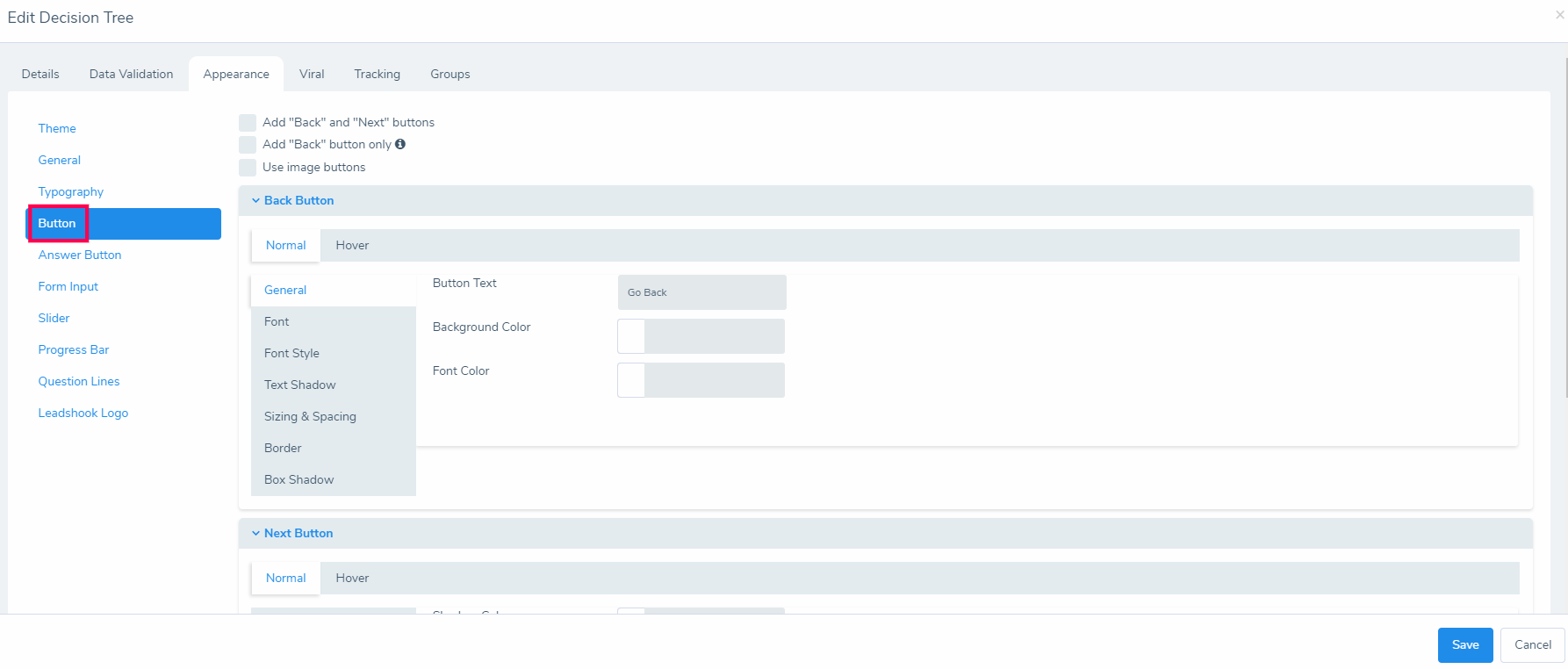
Normal vs. Hover: When the mouse cursor is not hovering on the button, the appearance settings under “Normal” will be shown. When the mouse cursor is hovering on the button, the appearance settings under “Hover” will be shown.
- General: Customise button text, background color, and font color.
- Font: Configure font style, font weight, font size, and line height.
- Font Style: Adjust letter spacing, transform (capitalization, etc.), and text formatting and alignment.
- Text Shadow: Configure shadow color, x-axis/y-axis shadow, and blur.
- Sizing & Spacing: Adjust button width, alignment, margin, and padding.
- Border: Set border width and border radius.
- Box Shadow: Configure box shadow color, x-axis/y-axis shadow, and blur.
Conclusion:
Customizing the appearance of your buttons can significantly enhance the user experience in your decision tree. A consistent and attractive button style can reinforce your branding and make your decision tree more engaging for users.
FAQs:
- Can I use different button formats in the same decision tree?
- Yes, each button can be individually formatted.

